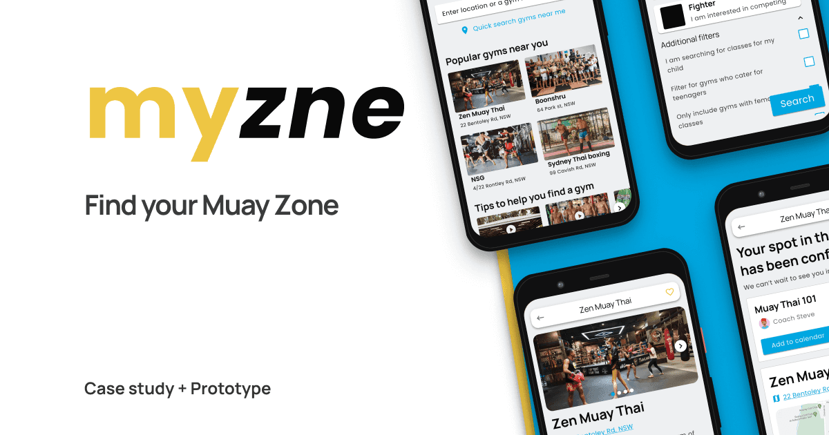
myzne
Design Thinking applied to an Athletes journey in Muay Thai
Client
Learning
Responsibilities
Conduct interviews, gather feedback from prototypes, iterate on UI.
Role
UX designer
Project time
2 months
The project
The intention of this learning project is to apply the design thinking process to Muay Thai. I will use myzne as a fictional brand, who is building an online Muay Thai gym platform for users to search, find and book a class at a gym.
The problem
Beginners to Muay Thai need help finding a gym nearby that fits their needs.
Goal
Use Design Thinking to design a mobile app prototype
Foundational Research
The project was kicked off by running a round of user research to begin empathising and understanding the users.
Using Reddit I reached out to 5 people who had expressed trouble finding a gym. Each participant was provided great insights into the decidion making process to join a Muay Thai gym, how they did it, and the overall experience going to a gym for the first time.
Pain points
The unknowns
First time users do not know what to expect from a class leaving them confused when deciding on a gym.
Inclusiveness
Users cannot see if they will fit in the group dynamic of a class and instructor.
Gym authenticity
Combat sport fans want to be part of a genuine gym teaching true martial arts.
Target audience
The research identified two target user groups with differing pain points and needs.
Jenny the combat sports fan
Jenny is a busy professional who needs an easy way to discover combat sport gyms with friendly inclusive group classes. She loves the gym for maintaining a fitness routine outside work with friends.

Chris the experienced athlete
Chris is a long time athlete with a passion for martial arts. He needs a way to find a gym for athletes that meet his standard of hard training his previous gym maintained.

A first timers journey to a gym
Both user's have similar goals in mind but take varying steps to getting to the gym. I decided to priortise the Jenny persona journey to align more with the teachings from the course on accessibility and removing bias.

Step by step user journey map from the users home to the gym.
Hypothesis
If a user with little experience in the sport is searching for their first gym, after watching a series of videos profiling a gym will be more inclined to attend a class
Designing based on insights
Sketch iterations were used to layout different ideas and solutions based on the user pain points from earlier. To get ideas on paper I used my favourite ideation technique - the Crazy 8s method - to ideate on different versions of each screen.
Multiple iterations of sketching wireframes to layout different ideas and solutions to user pain points. The confirmation screen went through many shapes attempting to include video that feels natural to the user experience.

Stacks of iterations using the Crazy 8s method to get ideas on paper.
Digital wireframes
Wireframes were created next to prepare the design solution for a round of user testing. As the screens developed from sketch wireframes I made sure to address user problems found during research with design solutions.
Innitially I wanted to experiment with a chat solution for users to interact with the gym. This layout took a Tik-tok approach to the user interacting with the website, letting them steer their way to booking a gym and learning about the gym a long the way.

Gym profile
View class videos and open video preview

Preview gym
Plays a preview introduction to the gym

Select a class
Scroll through classes with previews of each

Bring a friend
Options to bring a friend
Lo-fi prototype
The low-fidelity prototype flow connected the primary user flow of searching, finding a class, booking, and inviting a friend. On the 3rd iteration of the prototype I included an additional flow to test using video in search results.
Usability studies
Two rounds of usability studies were conducted to validate and gather further insights. Findings from the first study helped guide the designs from wireframes to mockups. A second study was run to gather feedback and further refines on a complete mock up prototype.
Talking with users I was able to gather data in a note taking spreadsheet to validate the positive use of the video features. User's would point out the missing video in the lo-fi prototype suggesting this would be very benificial for them selecting gym.
After a few iterations on the prototype, user feedback moved onto more functional requirements such as booking screen and usability.
Users require an overview of their bookings with history
Users want to keep a history of classes booked and attended so they can keep track of their schedule.
"Wait, I forgot when the class starts. Where can I see the booking?"
- Participant 3
The video pop up button needs to show the value and benefits to the user
Some users did not understand the benefits of opening the gym profile video pop up button.
"The page has a lot of information for me to decide on this gym but I’m not sure what this button does."
- Participant 5
Improving user navigation
The first iteration focused on using video to get users interacting with the gym profile. From the feedback received, the video preview button was change to a navigation menu.

Add a bookings screen
User feedback highlighted a need for a screen for users to check back when and what classes they have.

Mockup
The final high fidelity prototype guides the user on a clear path towards their goal of finding a gym with hints and guidance. Additional pain points found during user research are also resolved with screens for booking a class, inviting a friend and view their current and upcoming bookings.
End to end mockup
The final high fidelity prototype gave the user a clear path towards their goal of finding a gym which meets their needs. It also met their needs by allowing them to booking a class, invite a friend and then view their upcoming booking.
Next steps
Usability studies performed during the project helped validate certain aspects of the design but always raised more pain points and insights. I believe next steps for the project would include:
- A/B tests coud be used to further validate the way users open the gym preview page.
- A design sprint could be utilised to deep dive on solving the pains around users choosing which class to start with.
- A functional MVP with working videos would be the ideal next step to test emotional and behavioural impact video onboarding has on the user.
Conclusion
The final prototype concluded with multiple iterations towards validating the hypthesis new members would benefit viewing videos would help them on their journey to visiting their first Muay Thai gym. User testing provided insights and issues in the design which also helped align the user journey.
Impact
Users described feeling more comfortable making a decision which gym to choose to attend their Muay Thai class.
"I feel great choosing this gym, seeing a video and what classes they have makes me feel good with my decision."
- Participant 2
What I learned
Great insights can be gather by going out and talking with the end users. Finding participants turned out to be most challenging and the part I would like to systemise for the future.